Amway App
Case Study
Amway is a multi-level marketing company that needed a mobile solution to help their Independent Business Owners manage their businesses and order products on the go. It was Amway’s 1st North American E-Commerce Application.

16K+ Ratings
4.8 ⭐️⭐️⭐️⭐️⭐️
Free & Available in the App Stores
Role:
Lead Product Designer
Timeframe:
6 Months
The Scope:
I was tasked to lead the Product Design of the application with a Product Manager, a Scrum Master, two onsite Senior Software Developers, a Business Analyst, and an additional offsite Development team.
The product was to include both an e-commerce solution and business management tools and was set to 1st launch in North America then adopted globally across Amway’s markets. The demand was great and we had an extremely tight deadline to meet our beta launch goal in 6 months.
The Research:
To validate our assumptions about user needs, we gathered feedback from existing users of the web e-commerce and business tool experiences. This information was gathered through qualitative customer interviews, service call recordings, analytics, and feedback from users at conferences and other Amway events.
We also performed a competitive analysis of both the e-commerce and MLM business tools application spaces.
Once we had some design iterations we also engaged users at a conference and conducted a forced rank exercise to learn even further what information was most critical and engaging to the user so we could understand the priority and jobs to be done.

NPC User Interviews & Force Ranking Exercise
Total Users Engaged: 290
Preferred Languages:
English: 155
Spanish: 128
Mandarin: 3
Korean: 4
Research Results:
Pain Points
The current responsive web e-comm solution was too difficult to use, which is forcing users to only shop on web browsers on their computers, decreasing the opportunity for purchasing, and users really longed for a native experience.
The checkout process on the web (not even web responsive) was so painful it was causing a ton of users to abandon.
Users needed regular and quick access to monthly point value and bonus values for their businesses (both summative and product-specific analytics). This information was critical to helping them maintain and grow their Amway Independent Businesses.
Users were performing a unique "hack-like behavior” to hit specific monthly targets and maintain their status with Amway. They utilized the ‘cart’ as a ‘save for later’ or a ‘favorites list’ that they could later edit and use to purchase products right before the end of the month, depending on their Line of Sponsorship’s monthly performance.
The Problem:
Amway consumers did not have a viable mobile solution for shopping. Amway has cultivated loyal users because of the business opportunities Amway provides them but they are frustrated with the current experiences of both e-commerce platforms and business applications. Users needed to be able to manage their business, contact their Line of Sponsorship, and purchase products on the go.
Independent Business Owners need the ability to see their team’s personal business performance in order to maintain their own statuses. They were looking for easy ways to view opportunities to contact and coach their downlines for further business development & success.
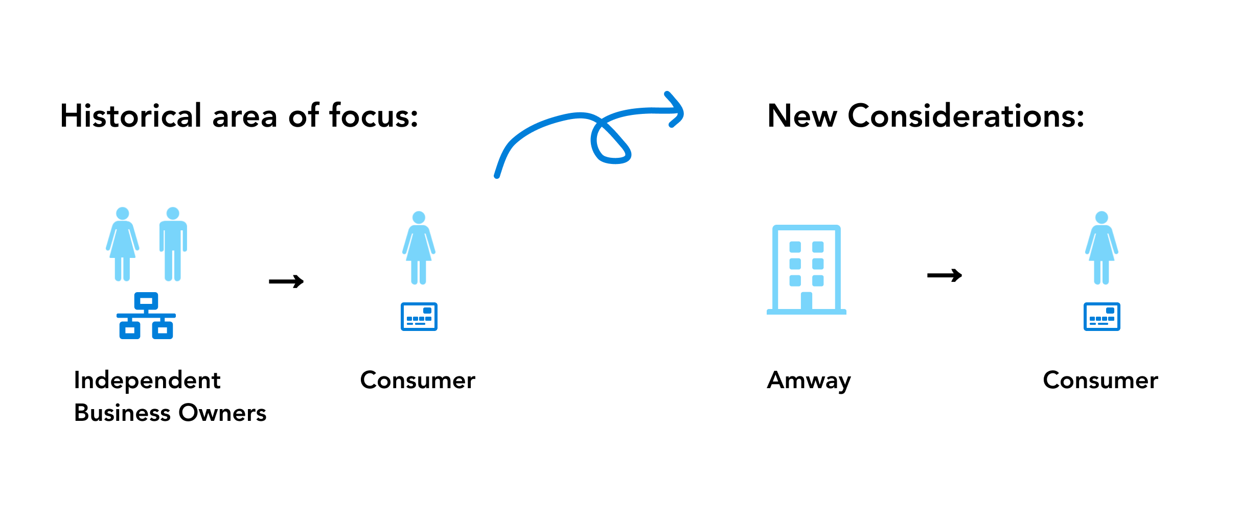
Amway North America was only providing users with purchasing options on amway.com, amway.ca & amway.com.do without any mobile solution besides a poor responsive web experience. They also did not have an on-the-go solution for their independent business owners to manage their businesses. This was a major problem considering most of these individuals have other day jobs in addition to selling Amway products. Amway understood that more than half of the population’s internet traffic was shopping on mobile devices yet they did not have a true mobile offering.
Amway also needed to reposition their Business Owner first mindset to be prepared for a direct-to-consumer mobile future.
Process
Before getting started iterating I wanted to establish some processes. I needed to explore how might we overcome our disciplinary divisions and become a well-balanced product team that uses evidence to inform product decision-making.
The way I approached this was by:


E-Commerce - Level Setting - what was the historical UX?
Key Screens


Line of Sponsorship (Business Tools App) - Level Setting - what was the historical UX?
Key Screens


Iteration
Design Principles
Information Architecture
Epic Definition
Proof of Concept
Feature Definition
Testing
High Fidelity Mocks
Testing
Launch Beta
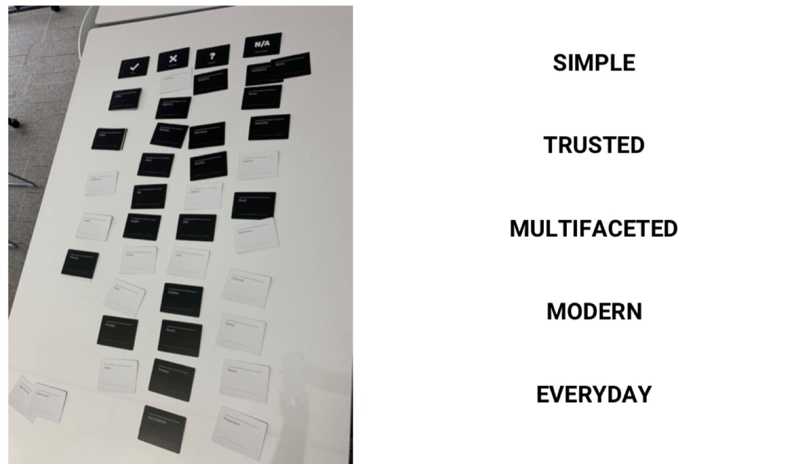
Design Principles - are awesome when carried throughout the project!
Since this project was from the ground up, I first gathered the team and ran the Brand Deck exercise, where all teammates sorted and placed words and their definitions under the headers of “we are” “we aren’t” “indifferent” or “n/a”. This exercise fostered product identity discussions which ultimately led to team alignment of design principles.
Information Architecture
The Solution - For the E-commerce portion of the app we focused on the following things:
We created a personalized e-commerce and business native application that allowed users to seamlessly make in-app purchases and manage their businesses in one experience.
I found it critical to provide users with a personalized home page that gave them their critical business statistics right up-front, the first thing they see when they launch the application, as well as quick links to e-commerce.
We also deemed it necessary to allow users to change the quantity of a specific product in their cart while browsing multiple products and not force them down the focused view of one product page at a time, which allowed users to bulk load their cart for a more seamless experience. We rearchitected the cart and checkout flow reducing process flows to 4 critical pages making for a much faster more delightful experience.
We also provided users with smart-search that allowed users to navigate to specific products in record time.
E-Comm Key Screens
The Solution - For the Business Tools portion of the app we focused on the following things:
We found it critical to provide users with a contextual view of their downlines, meaning only presenting them with one downline at a time as to not overwhelm or intimidate the user with too many statistics and content at once.
Making the content more contextual allowed users to focus on a specific team or person without having to scroll through sometimes thousands of downlines.
Designing for MOBILE FIRST was critical.
Business Key Screens
Business Prototype
Frontline 1st approach.
Seamless transitions so the user understands where they are in their org and never felt lost.
Key statistics up-front with detailed 3-month progress graph.
High-level view and deep dive functionality available to reach multiple persona’s needs.
Impact
The Amway App initially launched a Beta to a select group of users (336+ individuals) that signed up for access in Nov. 2019. We included a beta user feedback loop so we could iterate before launching to everyone.
User Testing and the Beta launch came back with extremely satisfied customers. The Business portion of the application enhanced performance and sped uploading times immensely because the server didn’t have to load everyone’s information all at once. Due to this success, we then opened up our launch to all Amway Independent Business Owners.
Global Market Adoption
Since the launch, the Amway app was positively received by other Amway markets across the globe. Alternative markets took the design of the product and adapted to their market’s specific needs while maintaining the majority of the UI/UX developed in the US.
Project Learnings
Localization is to be considered at every stage with a global product
Considering localization, translation, accessibility etc. was critical to the success of this project since it was designed and intended to be used by all nationalities all over the globe.
Process is Essential
For a project that is vast, it gives you a roadmap to navigate through what can be a foggy route. This is especially useful when you’re starting out.
Communication when working x-departmentally must be strong
Transparency and consistent communication when working with multiple teams for one product was paramount. Consistent language to discuss decisions that was adapted by everyone including the usage of metaphors allowed me to drive user needs home, and allowed us to not lose sight of that amongst competing business goals.